
Typography 101: Why Your Choice of Font is the "Tone of Voice" for Your Brand
Imagine you receive two letters in the mail with the exact same message: "I need to see you right now."
The first letter is written in elegant, flowing cursive on heavy, cream-colored paper. The second letter is written in jagged, frantic, red crayon on a torn napkin.
The words are identical, but the message is completely different. One feels like a romantic invitation; the other feels like a horror movie.
That is the power of typography.
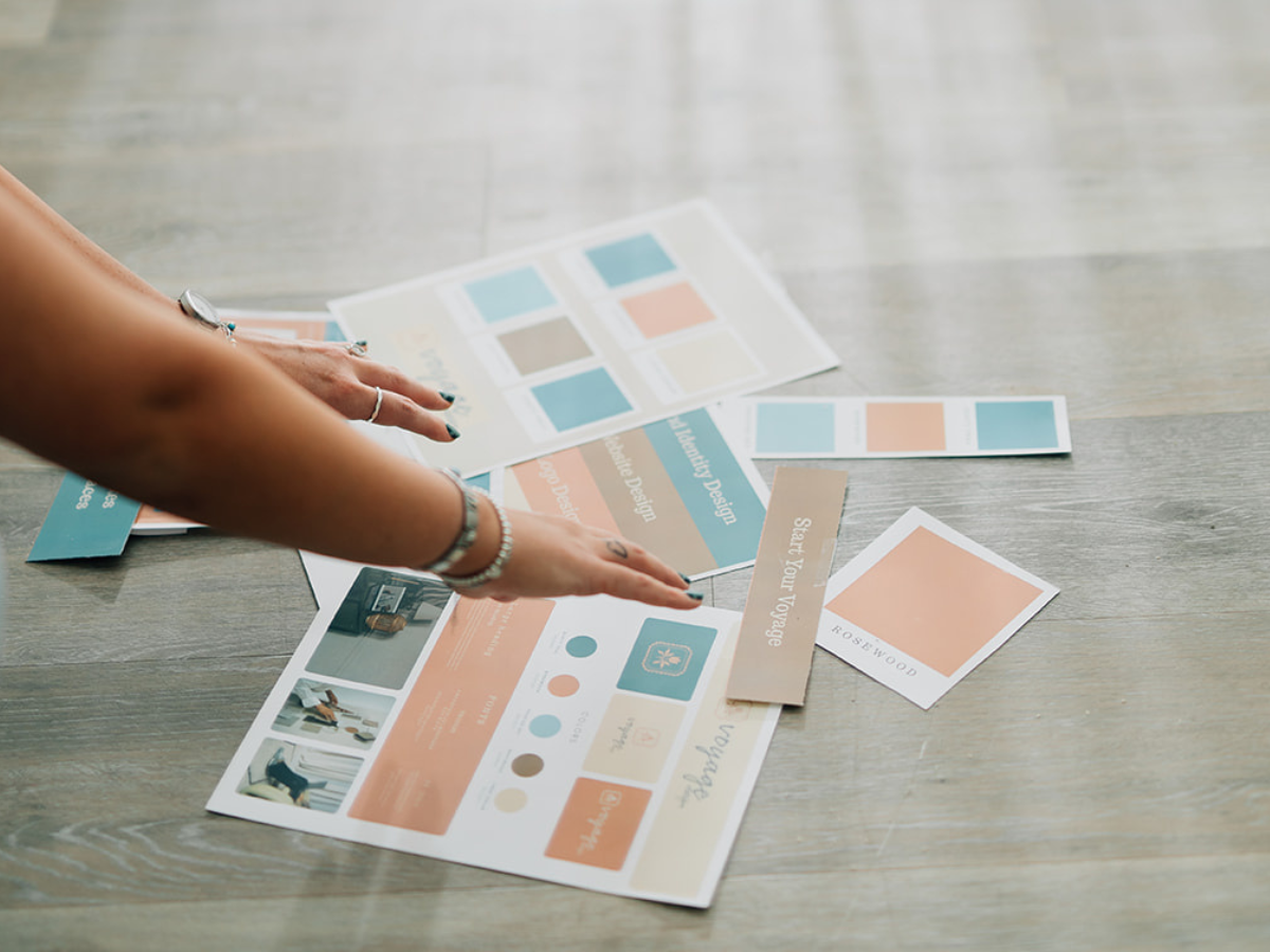
At Voyage Design, we spend hours obsessing over font choices because typography is literally the tone of voice for your brand. If your copywriter writes a hilarious, approachable welcome email, but you format it in a rigid, aggressive, corporate font, the joke won't land. The visual tone has to match the written word.
Before you pick a font just because "it looks cool," you need to understand what it's secretly whispering to your audience. Here is your crash course in Typography 101.
1. Serifs: The Old Guard
The Vibe: Trustworthy, authoritative, traditional, and intellectual. The Look: These are the fonts with the little "feet" or decorative strokes at the ends of the letters (think Times New Roman or Garamond).
Serif fonts are the anchors of the typography world. They have been used in print for centuries, which means human beings are subconsciously wired to view them as established and reliable.
If you are a financial advisor, a high-end luxury fashion brand, or a legal firm, a Serif font tells your audience, "We have been here a long time, and we know what we are doing." However, if you are a disruptive, edgy tech startup, a heavy Serif might make you look dated and out of touch.
2. Sans-Serifs: The Modern Navigator
The Vibe: Clean, modern, approachable, and efficient. The Look: "Sans" means "without." These fonts do not have the little feet on the letters (think Helvetica, Arial, or Proxima Nova).
Sans-serif fonts are the sleek speedboats of design. They are stripped down to their most essential geometry, making them incredibly easy to read on digital screens.
This is why almost every major tech company (Google, Spotify, Airbnb) uses a Sans-Serif font. It communicates that your brand is forward-thinking, accessible, and user-friendly. If your business relies on a digital app or a highly interactive website, a clean Sans-Serif is usually your best bet for the heavy lifting.
3. Scripts: The Artisan
The Vibe: Elegant, personal, creative, and luxurious. The Look: Fonts designed to mimic human handwriting or calligraphy.
Script fonts are beautiful, but they are dangerous if you don't know how to navigate them. They add a deeply personal, human touch to a brand, making them perfect for wedding planners, boutique bakeries, or high-end photographers.
But here is the golden rule of Script fonts: Never, ever use them for paragraphs. They are incredibly hard to read in large blocks of text. Use a Script font like a loud accessory—perfect for a signature, a short tagline, or a logo mark, but terrible for your website's "About Us" section.
4. Display Fonts: The Megaphone
The Vibe: Loud, quirky, specific, and highly stylized. The Look: Chunky, warped, retro, or highly decorative letters.
Display fonts are designed to do exactly what their name implies: be displayed. They are the attention-grabbers you use for giant website headers or bold poster designs. They inject massive amounts of personality into a brand very quickly.
If you own a retro arcade bar or a disruptive energy drink company, a wild Display font is your best friend. Just keep in mind that they are not meant to be read at small sizes.
The "Two-Font" Rule (Pack Light)
The biggest typography mistake businesses make is using too many fonts at once. It looks chaotic, desperate, and amateurish.
When you build your brand identity, stick to the Two-Font Rule.
The Header Font: This is where you inject your personality. It can be a bold Serif, an interesting Display font, or a sleek Sans-Serif.
The Body Font: This needs to be the workhorse. It should be a highly legible, simple font (usually a clean Sans-Serif or a classic Serif) that people can read for five minutes without getting a headache.
Contrast is the secret sauce. Pair a tall, elegant Serif header with a short, modern Sans-Serif body font. The tension between the two is what makes professional design look so good.
Ready to Find Your Voice?
Typography is an art and a science. The right font combination can instantly elevate your business from a "side hustle" to an established authority.
If your current branding feels like a mismatched puzzle, let's fix it. Contact Voyage Design today, and let's find the exact visual tone of voice your brand needs to be heard.